Fieldtrip
Brand Identity + Launch Assets
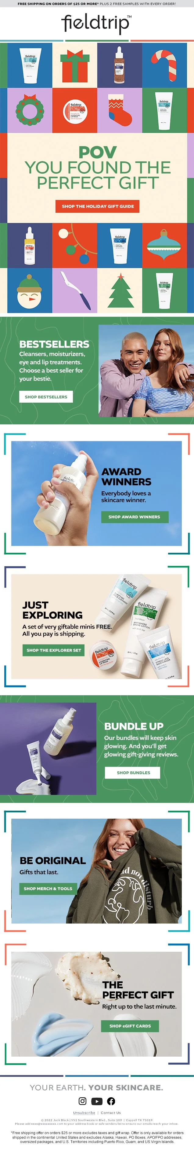
As the world shifted to remote work in early 2020, Edgewell Personal Care set out to launch a new gender-neutral skincare brand designed for Gen Z. The result was Fieldtrip, an eco-conscious, adventure-inspired brand celebrating globally sourced ingredients, sustainability, and self-expression.
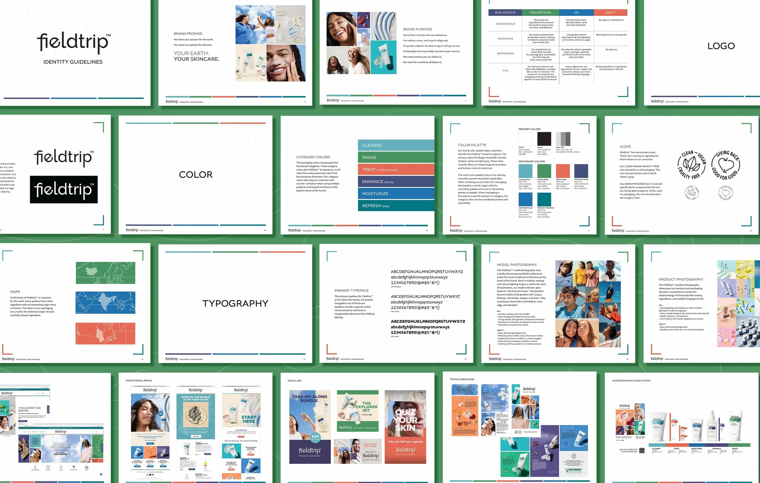
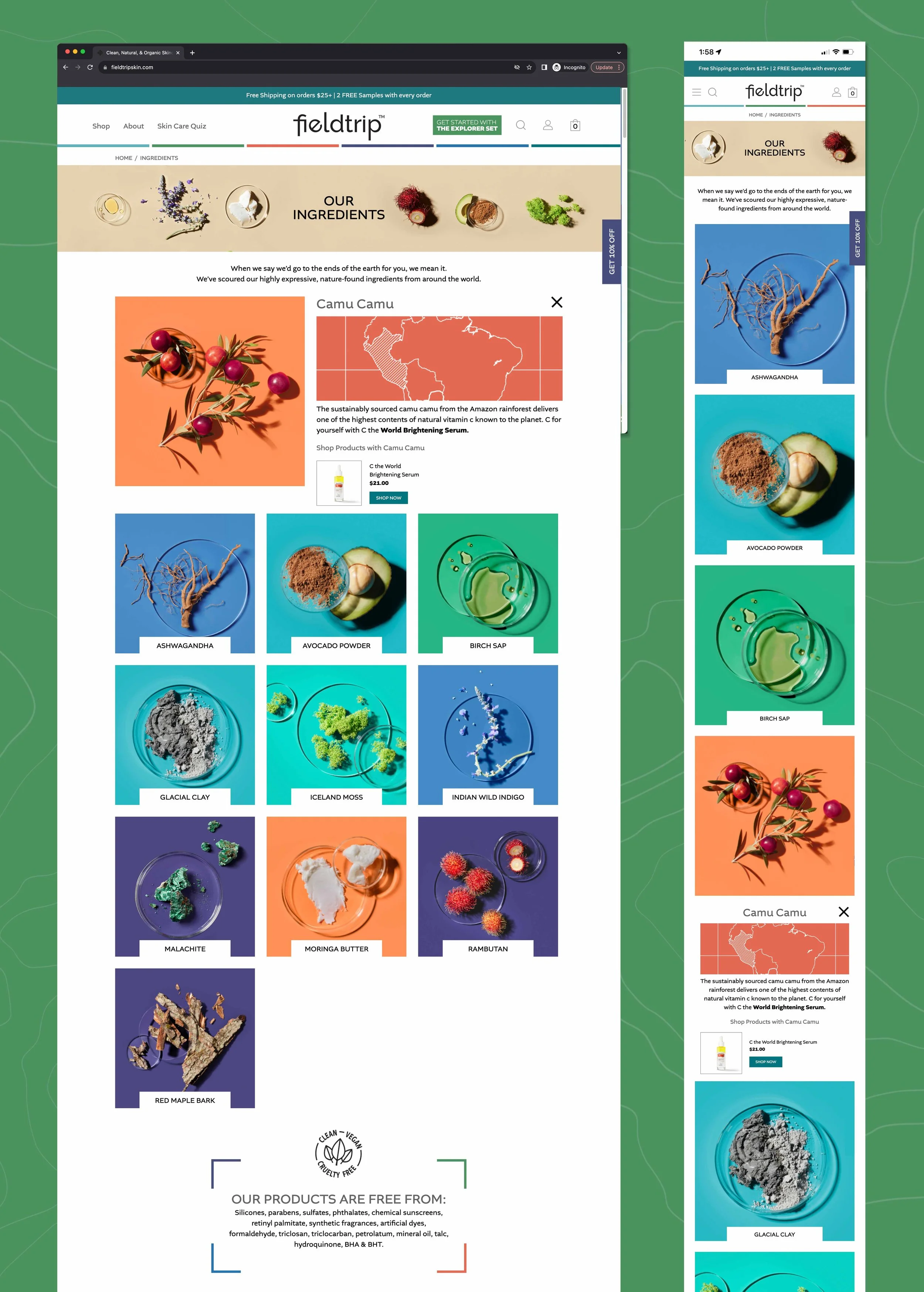
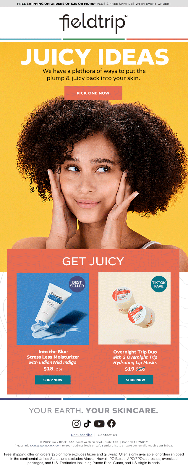
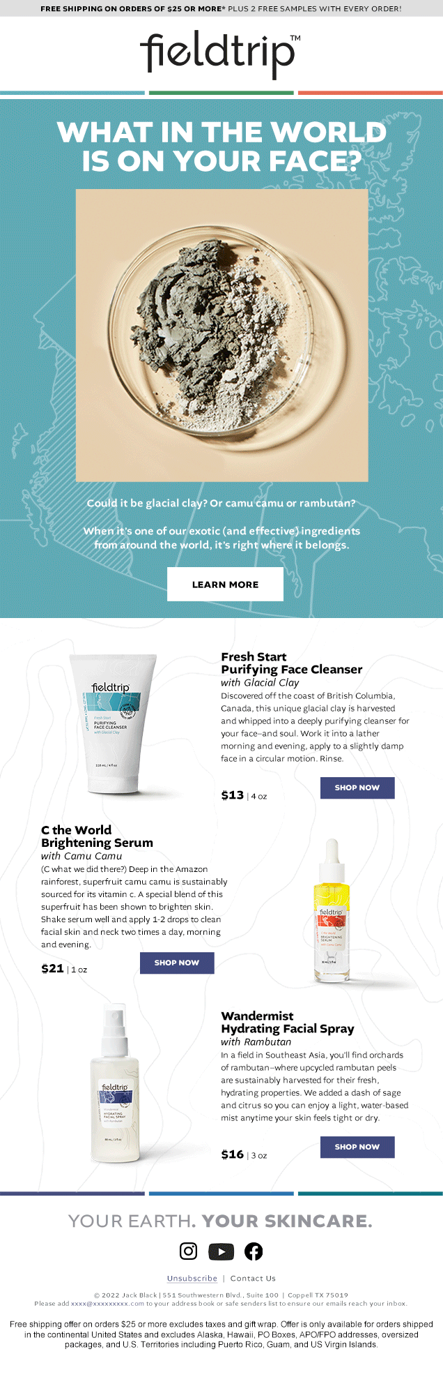
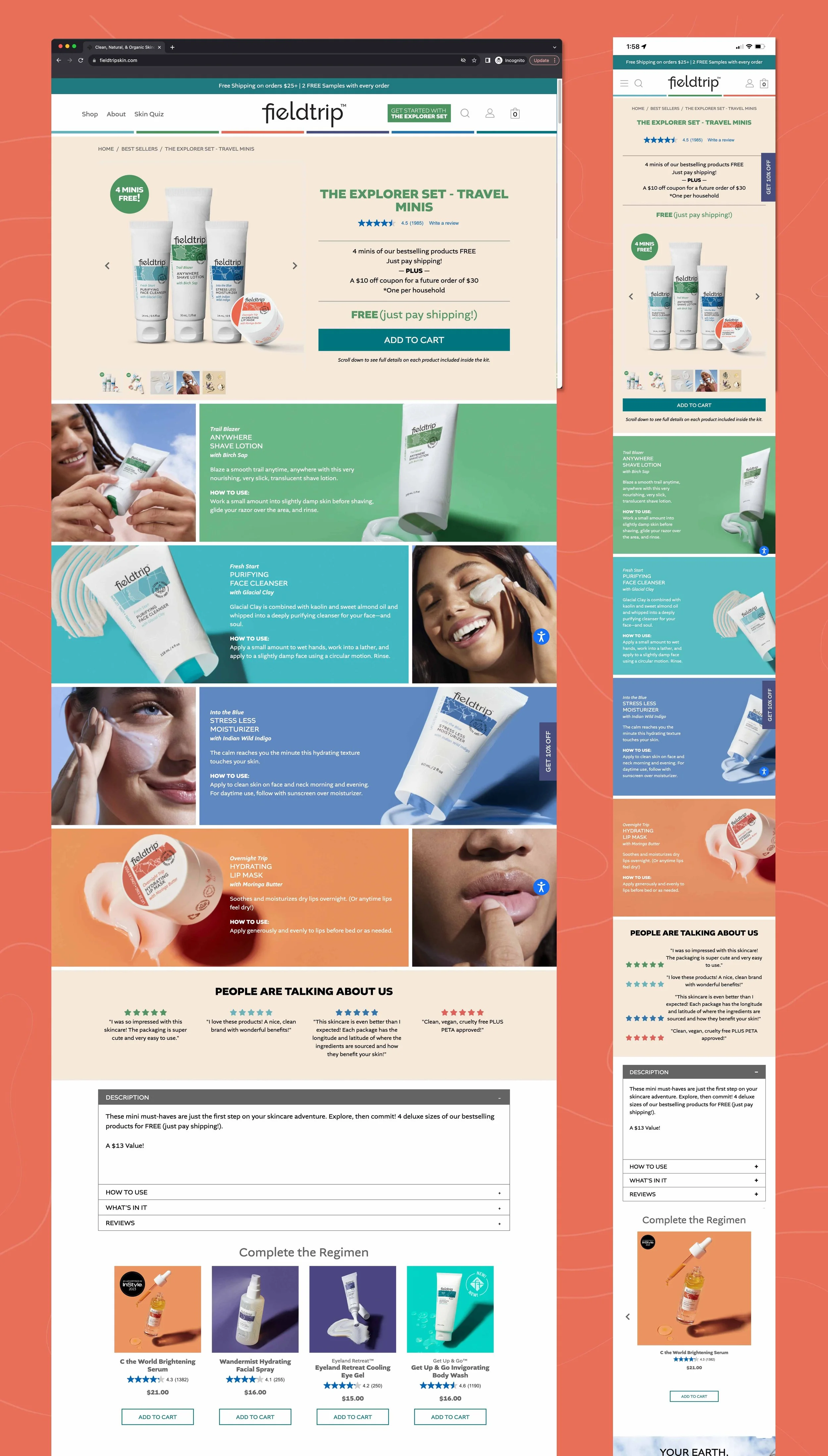
I played a core role in shaping Fieldtrip from concept through launch. From brand naming to logo design, color systems to packaging graphics, and photo direction to DTC web design, I helped bring the brand to life across every visual and digital touchpoint. Inspired by travel and nature, the visual system featured bold color-coded product categories, map motifs, topographic textures, and a custom passport-stamp badge denoting the brand’s clean, vegan values.
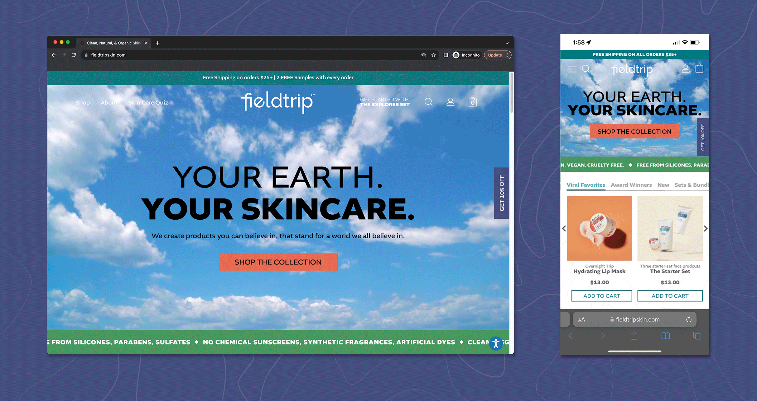
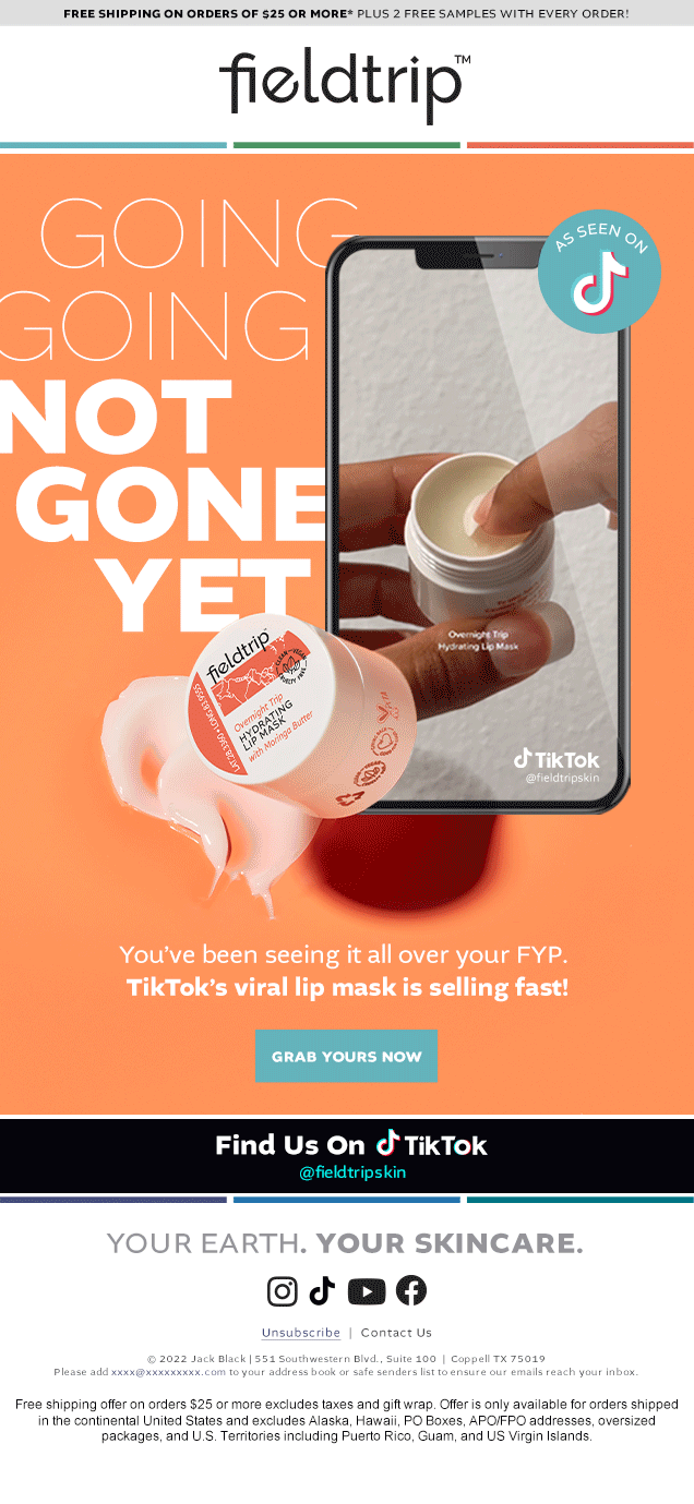
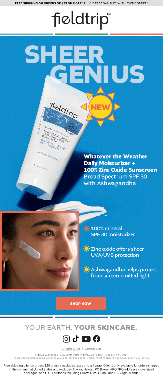
I also co-led creative development of Fieldtrip’s photography—collaborating on concept, casting, styling, and shoot direction—and helped translate the brand’s visual identity into an immersive e-commerce experience. To streamline design feedback with the development team, I taught myself Adobe XD and led UI design for the launch site.
Key Responsibilities:
Brand ID & Guidelines Development
Logo Design & Tagline
Model & Product Photo Art Direction
Packaging Concept Designs
Copy & Naming Input
DTC Website Design (UI/UX)
Email Design
Vendor & Team Coordination